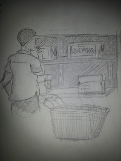
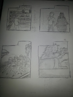
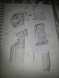
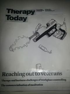
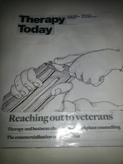
I went straight into working on my sketch book drawing various designs. I decided to mix my two idea for the project not just sticking to one idea. I wanted to design one idea for the cover and one for the inside of the article.
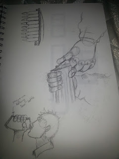
I then moved onto working to context so I went to finding the correct measurements for the cover and inside of the article also fitting the images to look like they belong in the articles. I created various roughs based on my sketch book I tried at painting using Gouche paint which unfortunately didn't work out for ny work, designs for an example I have displayed the roughs that I believe are my strongest at referencing the key points in the article.


No comments:
Post a Comment